
Health Insurance Member Portal
Redesigning Select Health’s member portal to streamline access to key information and provide comprehensive support for managing insurance needs.
My Role
Lead UX/UI, Prototyping, Dev handoff, QA, Design System Management
Tools
Figma, monday.com
Team
2 Contract UX/UI designers, 1 internal Lead UX designer (~3 months), Product Owner, Internal development
Timeline
January 2022–September 2022
The Challenge
When I joined the team at Select Health, they had just wrapped up months of research and internal planning in preparation to begin working through their revamped member portal. They hoped to not only bring a refresh to the visuals, but also to make finding important information more intuitive and capitalize on opportunities to educate the user on the complicated world of health insurance as they navigated their coverage.
Unique challenges emerged while navigating the intricacies of health insurance plans and contending with the use of multiple third-party softwares. Additionally, Select Health is part of a larger healthcare network, which had its own set of requirements for the site.
Due to the departure of Select Health’s internal UX designer, I ended up taking lead on the project a few months in. I initially was responsible for the web experience, but eventually jumped in on work overseeing the native app as well.

Original Member Portal (web & native app)
The Goals
1. Improve the UX of the existing portal experience and bring a visual refresh to the outdated UI.
2. Ensure easy access to key information like billing, policy details, coverage summaries, and explanations of benefits.
3. Help users navigate their coverage by providing timely and contextual explanations and definitions for complex terms or processes.

Feature prioritization

Initial Web Information Architecture
Design
The project's overall UI direction was partially established by the internal designer before my involvement. A initial design system was in the works as well, which I ended up taking over a few months into the project.
There were a multitude of use cases and variables to account for in working through screens. Because Select Health offers such a wide variety of plans, we had to ensure the layout would be flexible enough to account for changes in what sections are shown depending on plan types. We ultimately landed on a card layout, which allowed for entire sections to show, or not show, as well as be able to flex the card widths across columns.
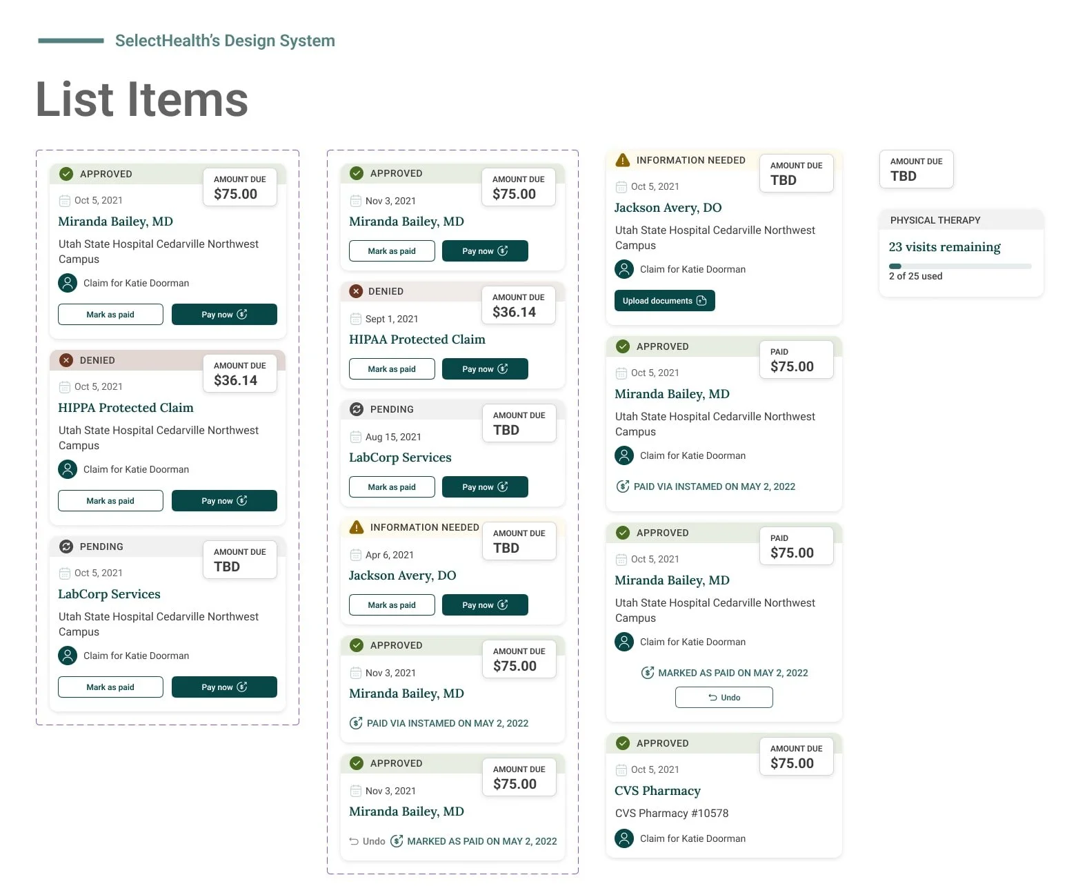
Sample of various claim card states that I built out in the design system

Dashboard: Houses quick access and summaries to the most commonly accessed data.

Cost Estimator Tool: Members are able to search various procedures and appointment types and compare prices across locations.
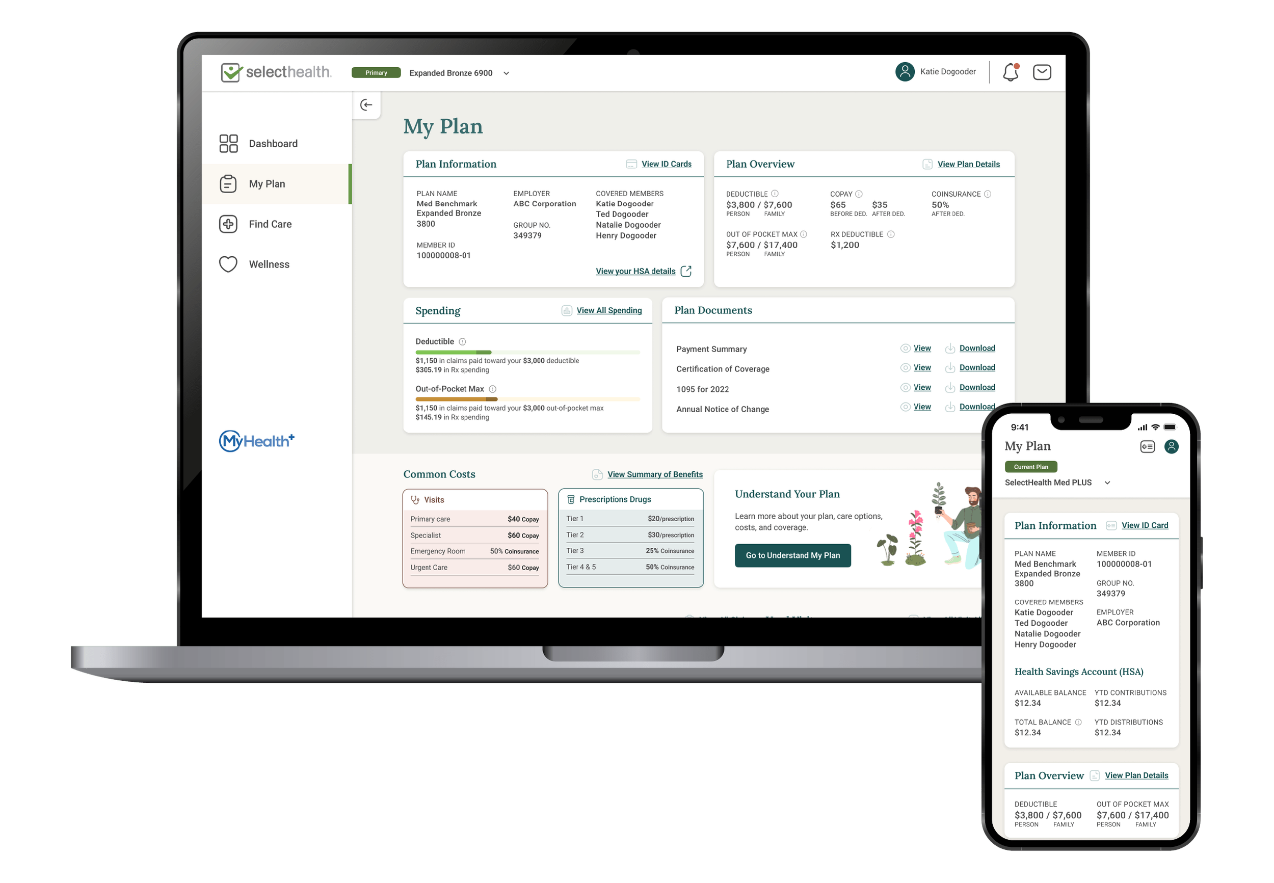
My Plan: Provides an overview of all plan specific information with contextual tooltips and links to help make sense of coverage.

Claim detail: Provides a detailed breakdown of cost, as well as indicating how that impacts overall plan spending.

Spending: Breaks down spending at various detail levels and provides contextual information for increased understanding.
Final Designs
Upon completion of the designs for web, mobile responsive, and native portion of the portal, I rolled off of the project. Before leaving, I was also able to do some QA on the portions of the portal that had been developed up to that point. Additionally, I ensured the design system was in a solid place for the developers and future designers to reference.
